After reviewing my task list from my previous post, I did some thinking, and I identified that my biggest insecurity is color theory (aka mixing the ‘perfect’ skin tone).
If you’ve ever purchased a standard 12, 24, or even 36 color set of colored pencils or markers, chances are there will be one standard-issue brown (and maybe one light tan color if you’re lucky). I always found myself struggling to find the right amount of white, yellow, orange, blue, and black to add to the brown to create a realistic skin tone.
But taking a close look at any person, there are dozens of colors present in every person’s face due to their pigmentation, lighting, and anatomy.
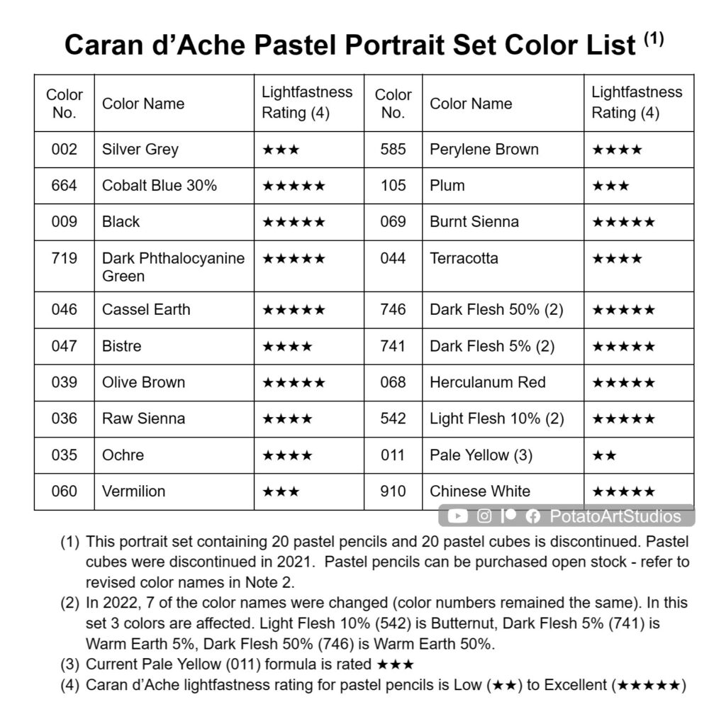
Not knowing where to start, I decided to leave the task of picking a traditional ‘portrait’ set up to the experts. I purchased a 20-color portrait set from the brand Caran d’Ache. Although this specific set is no longer sold, I’ve labeled the color numbers if you wish to purchase individual colors. More information about lightfastness is listed in the second table.
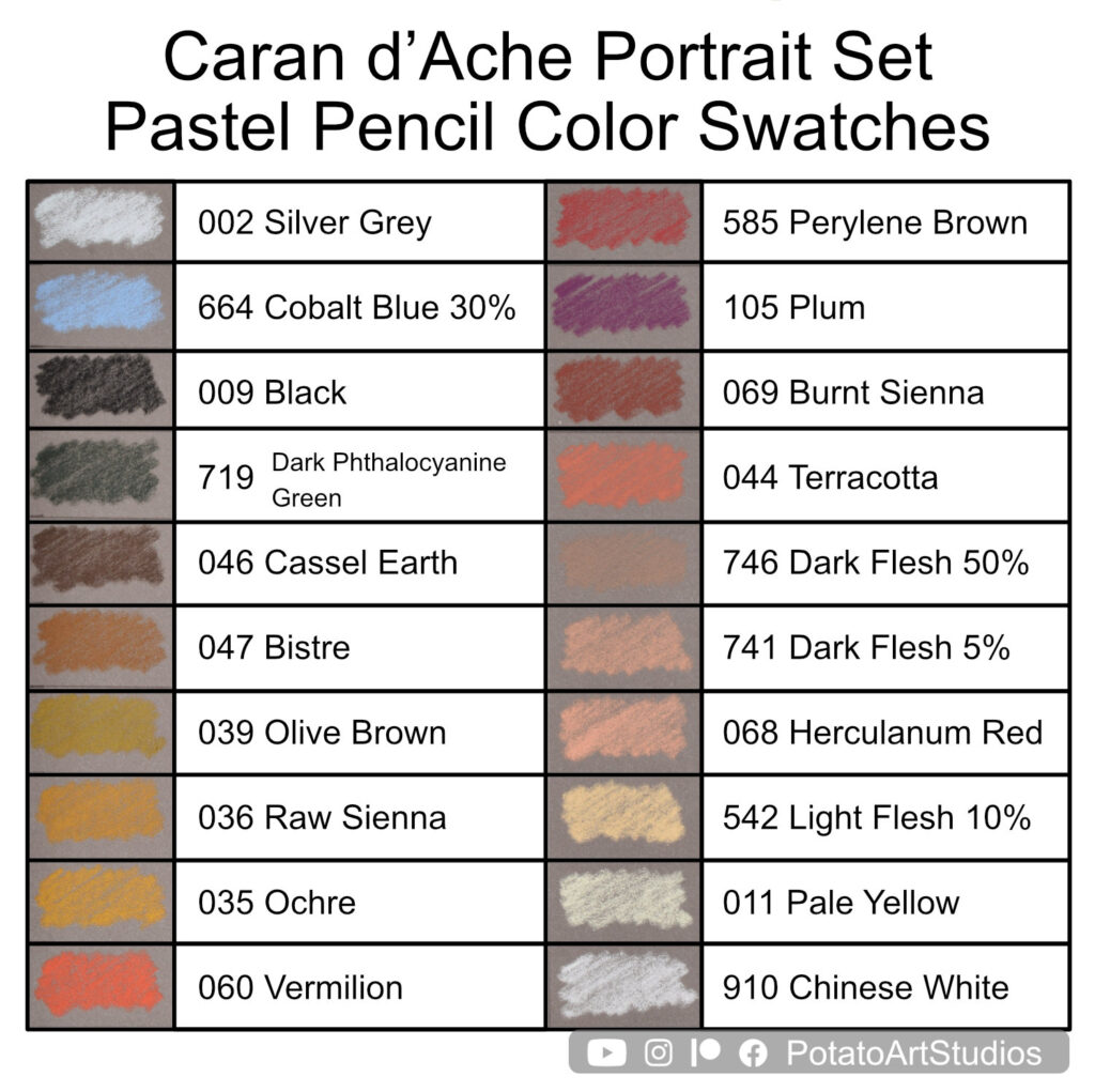
A quick overview of the range is that it leans towards the conventional light and medium skin tones. I was disappointed to see that the medium-deep and deep colors were limited. Trying to put a positive spin on things, I felt that the limited range of darker values would encourage me to explore color blending. Overall, confining my color choices to a mere 20 would help me through the ‘decision fatigue’ of trying to find the ‘perfect’ color and push me to quickly reach for a color that would do the job.
For the first week’s portrait homework, I decided to keep things simple and aim to draw just one facial feature with a time limit of 30 minutes. I also had my notebook to do quick self-critique sessions after each study was completed.
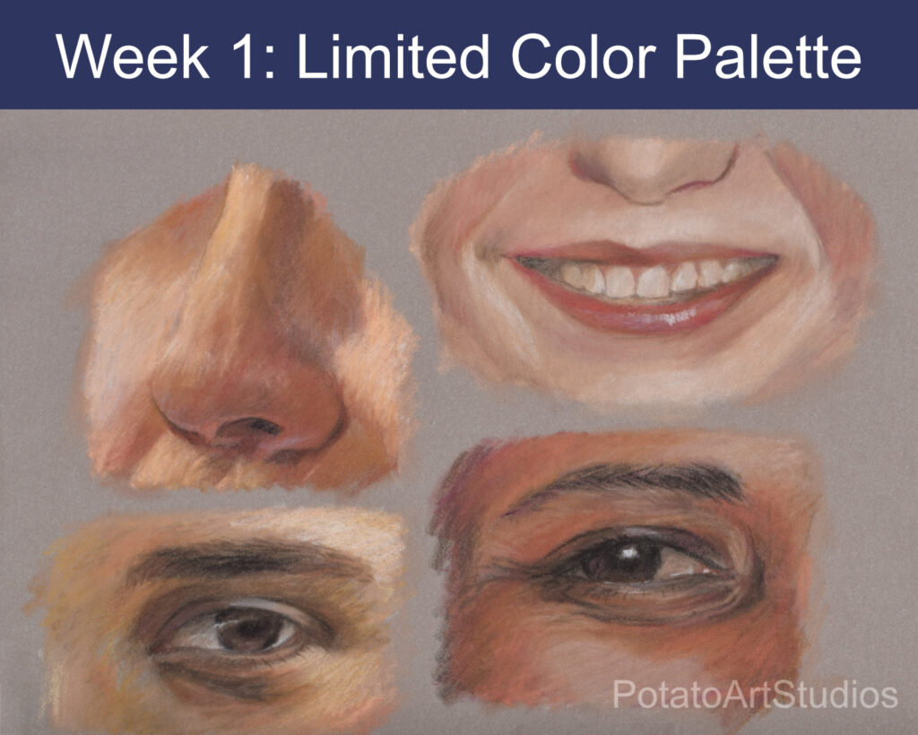
Week 1: Limited Color Palette
Main Tasks:
- Encourage color blending
- Prioritize value over hue
Rules:
- Less than 1 hour per study (aim for 30 minutes or less)
- Focus on one facial feature at a time
- Limit of 20 colors
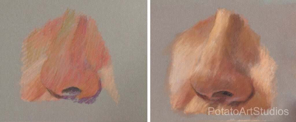
Study 1: Male Nose
Time: 30 minutes
Study Notes:
- With a toned grey paper, it takes a lot of pastel to build up the light areas with only pastel pencils.
- The light blue (Silver Grey 011) was helpful to tone down the warmth from the light peach colors in the cheeks.
- The mid-value warm color (047 Bistre) was the predominant shadow color. I wanted to reach for a less-yellow transition color between the highlights and shadows.
Study 2: Male Eye
Time: 30 minutes
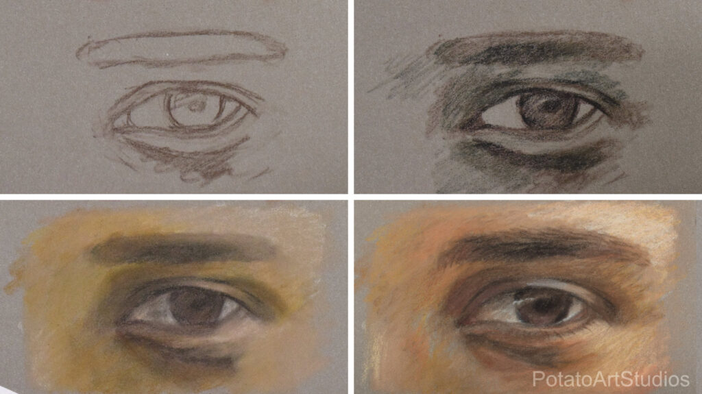
Study Notes:
- A medium brown color (mentioned in previous nose study) would have been ideal to use for the base of the skin tone. I combined Cassel Earth (046) & Bistre (047) to achieve a similar value, but the result leaned on the green/sallow range.
- Black (009) worked well when used sparingly (in the densest part of the center of the eyebrows, pupil, and upper eyelid).
- The sclera (white of the eye) was colored with the pastel blended from the shadow skin areas and some black and white added.
Study 3: Female Mouth + Teeth
Time: 50 minutes
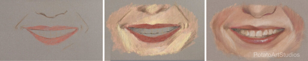
Study Notes:
- This study ran significantly over the time limit due to issues with finding the teeth color (desaturated light yellow).
- Available colors in similar value (white, light yellow, and peach) were too bright to use for teeth. I used Black (009) + Cassel Earth (046) to desaturate the teeth.
- The subtle transitions of color between the left and right halves of the upper lip could be cleaned up with more time.
- Adding warm colors (Pale Yellow 011 & Light Flesh 10% 542) in the early stage was a mistake. The overall skin tone is pink (cool-toned).
Study 4: Female Eye
Time: 30 minutes
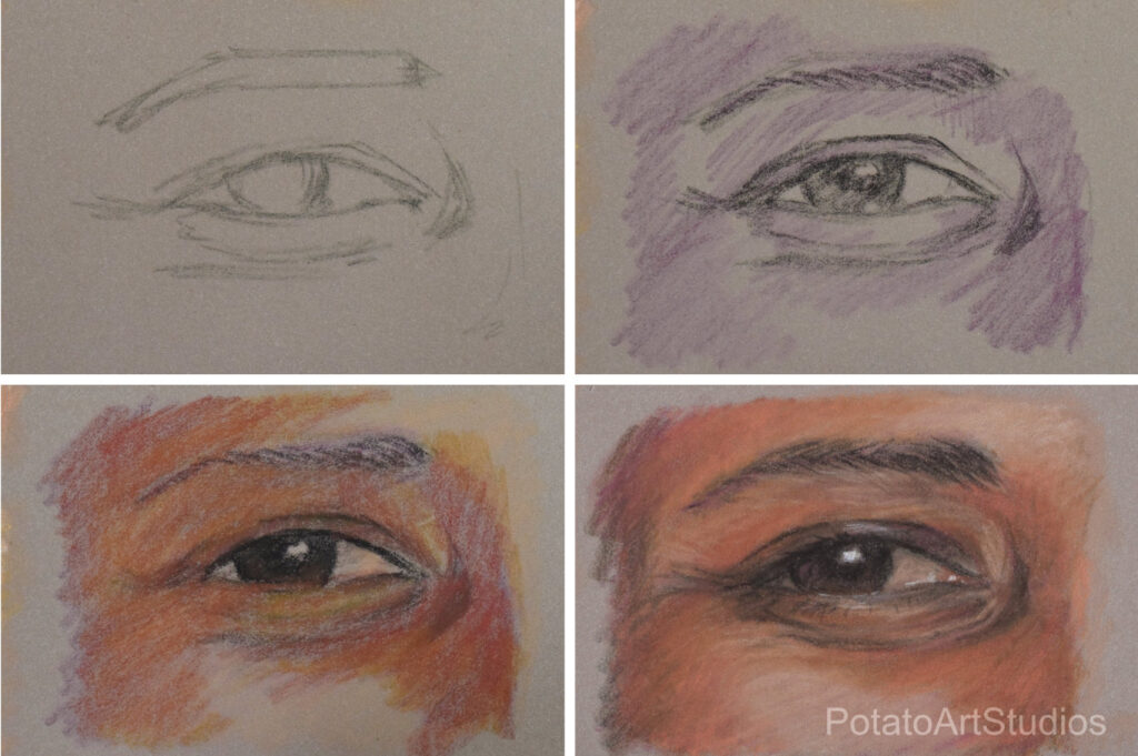
Study Notes:
- Once again, the lack of darker colors was very challenging. I leaned into the red and purple colors to set up the drawing – starting with blocking in the shadows with Plum (105).
- Working from dark to light was very efficient when building the second and third layers. Learning from Study 3, I restricted the amount of yellow used in the mid-value areas.
- The highlighted areas (cheek and center forehead) looked dull. Will need to troubleshoot how to brighten darker skin tones without losing the ‘glow.’
- With light pressure, Dark Phthalocyanine Green (719) can be added to Cassel Earth (046) to darken areas without ill effects.
Week 1: Take Away Lessons
- Drawing facial features 1:1 scale or slightly larger makes drawing and coloring much easier.
- Have a “scratch” sheet of paper to experiment with color mixing to make the color matching process less stressful.
- After identifying the ‘missing’ colors from the 20-color portrait set, it may be helpful to grab 3-5 additional colors after the portrait is 50% or more developed.
- Blending with a sponge (SOFFT tool or similar tool) saves time to develop an even layer of pastel when there are uneven gaps left by hatching color in with pencils.
- Use the guides in the photo editor to simulate plumb lines on the digital reference photo. Use a ruler to check the alignment of features on the physical drawing.
- Drawing teeth is hard!
Stay tuned for week two’s portrait studies! If you’ve found this series interesting, let me know by leaving a comment below. If you have portrait drill-style exercises that you found helpful, leave a description of those as well!
-Lauren